

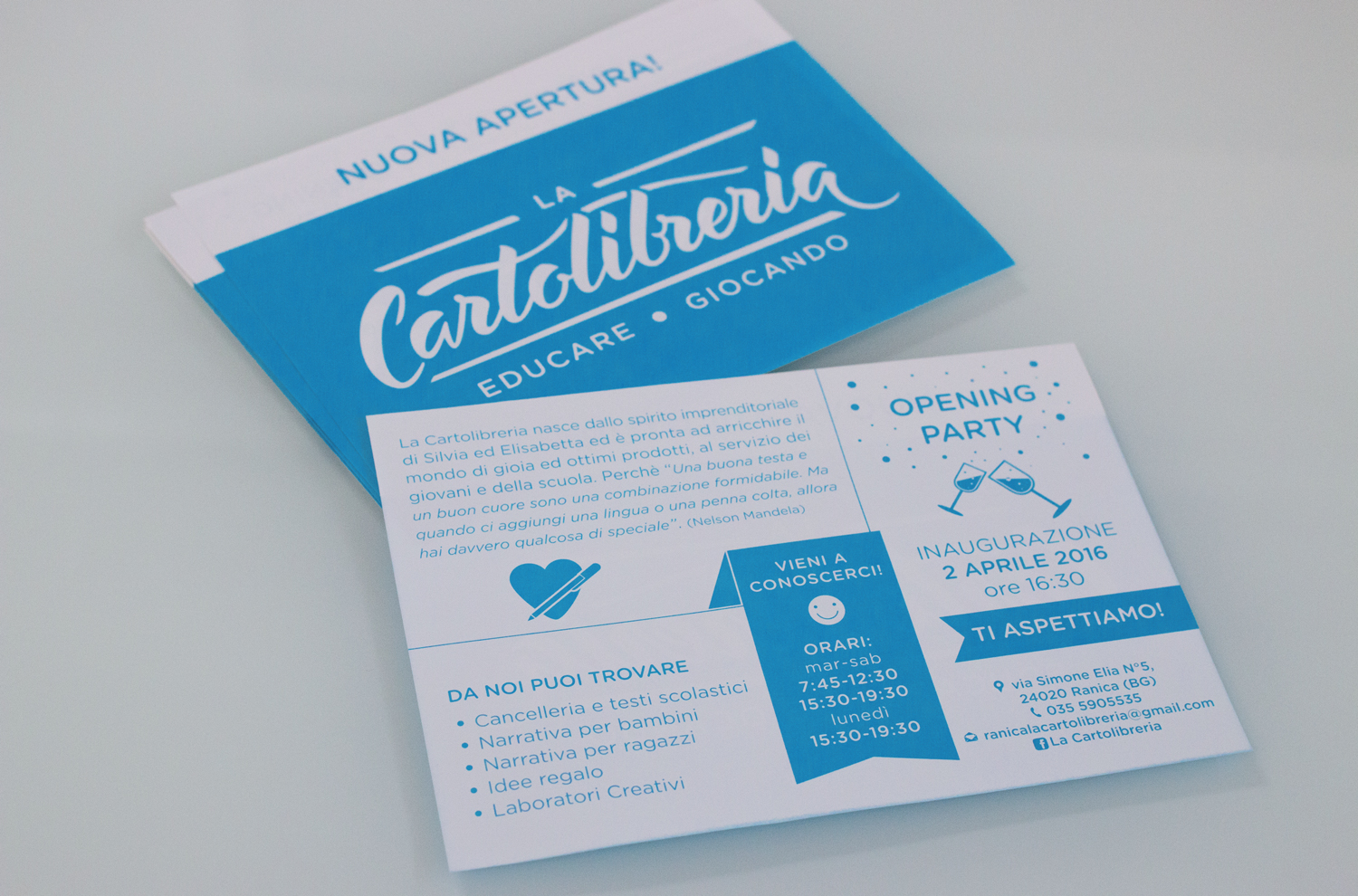
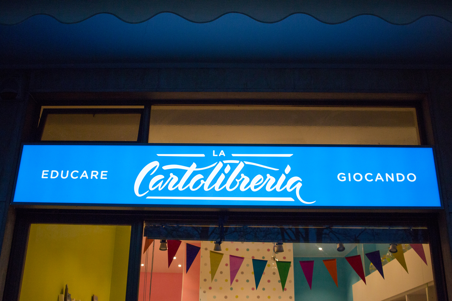



When two extraordinary women decide to come together to fulfill their dream of opening a shop, the logo that represents them must be truly special—an emblem that captures the essence of their passion and vision. Thus, the project for "La Cartolibreria" was born, the new go-to spot in Ranica, created for Silvia and Elisabetta. For this store, which blends modernity with a touch of retro charm already evident in its name, I set out to design a logo that reflects this duality.
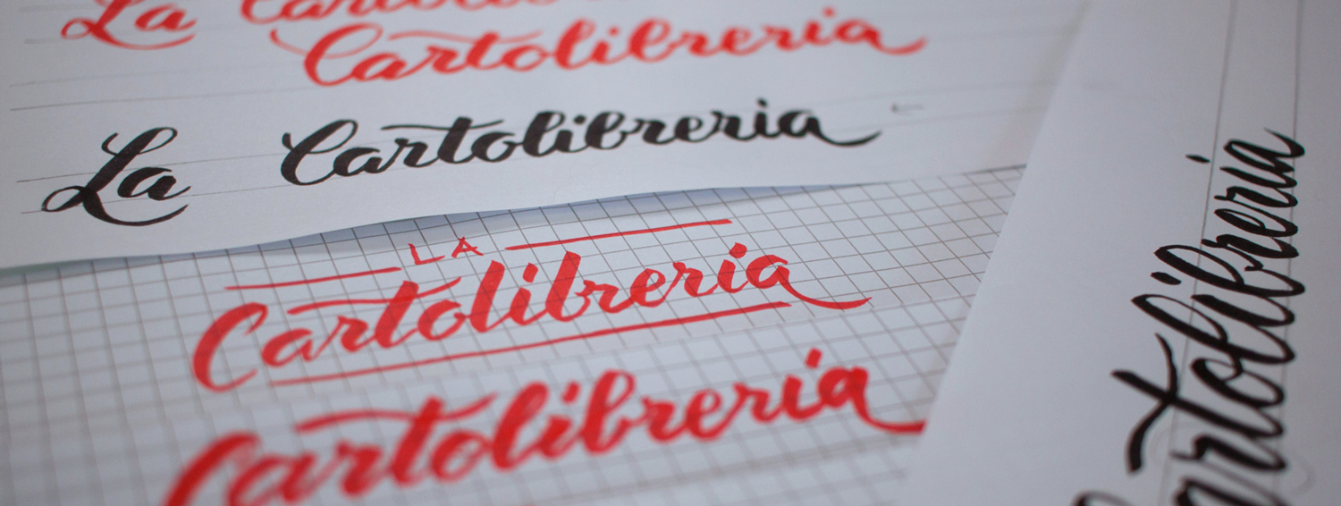
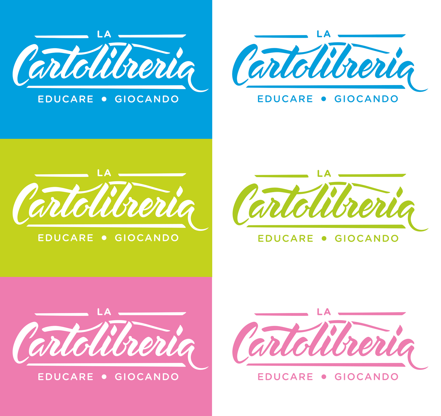
The result is an elegant fusion of past and present, crafted through a reimagined English cursive script, made contemporary by using a Brushpen instead of the traditional nib. The logo creation process was careful and meticulous: starting from numerous sketches, I selected the one that best represented the store's identity, scanned it, and reworked it into a vector format. I then balanced the contrast between the letters, perfecting the thickness and kerning until I achieved a final version that works perfectly in both positive and negative formats, with color variations suitable for different applications.
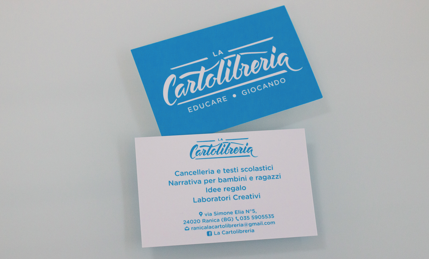
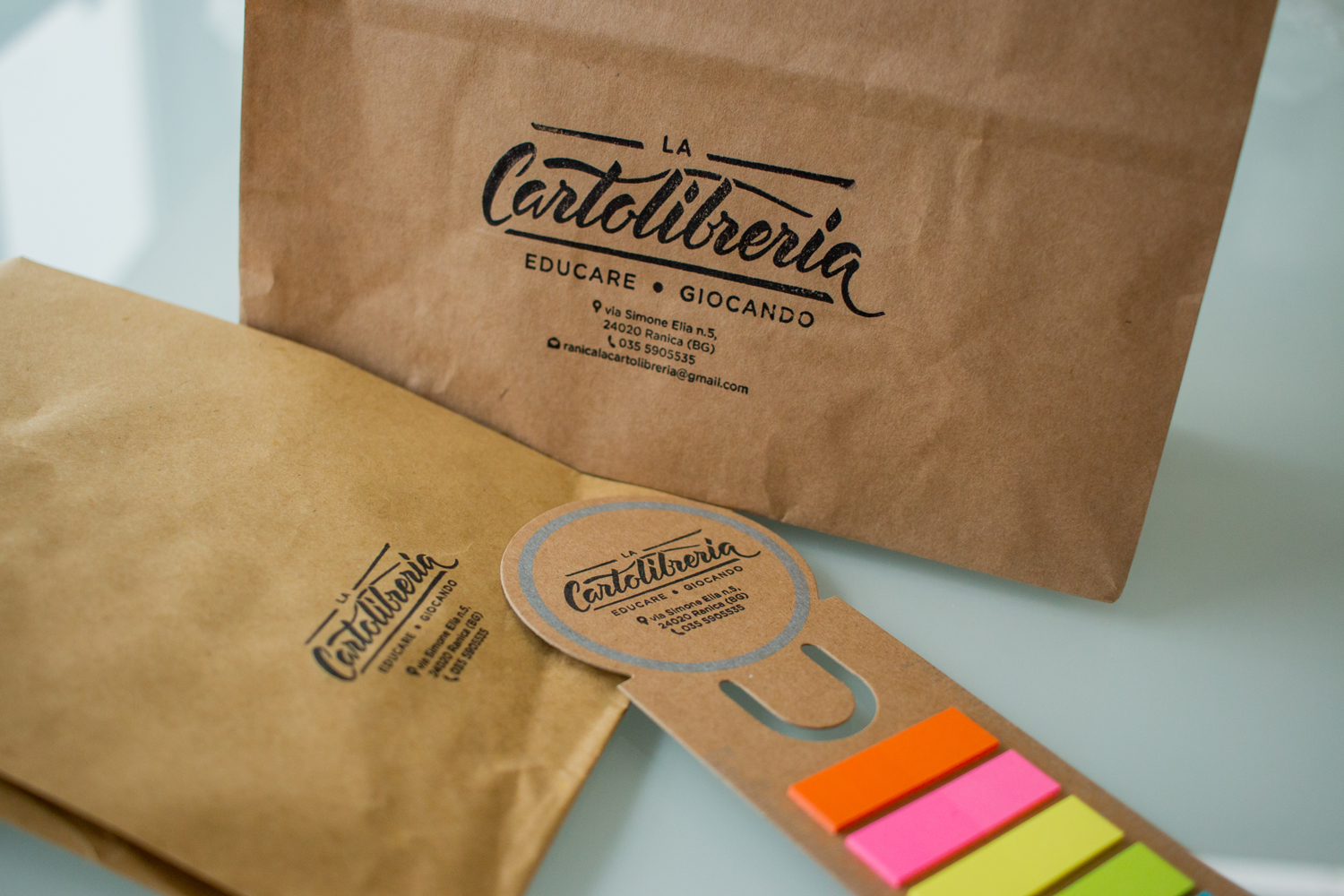
But we didn’t stop at the logo: the store’s coordinated image was carefully crafted in every detail. Business cards, flyers, stamps, gadgets, and the store sign were all designed to create a strong and recognizable visual identity, providing customers with a unique and consistent experience.
Curious to learn more about their beautiful counter? Discover it by following this link.
Alice Tebaldi