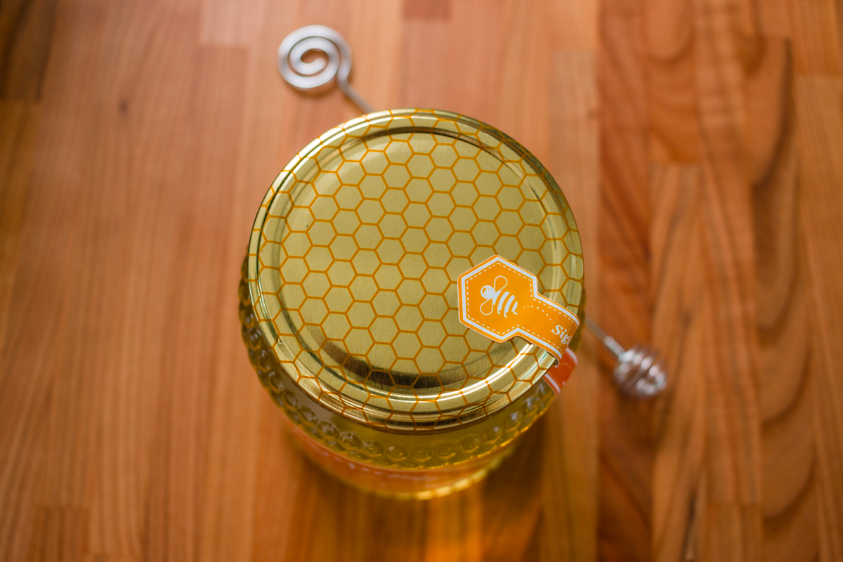
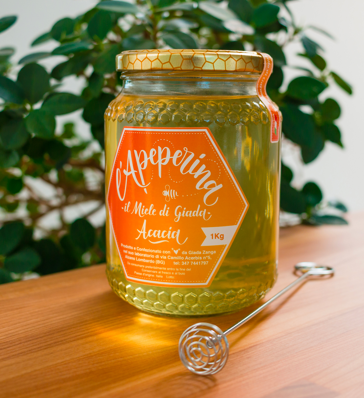
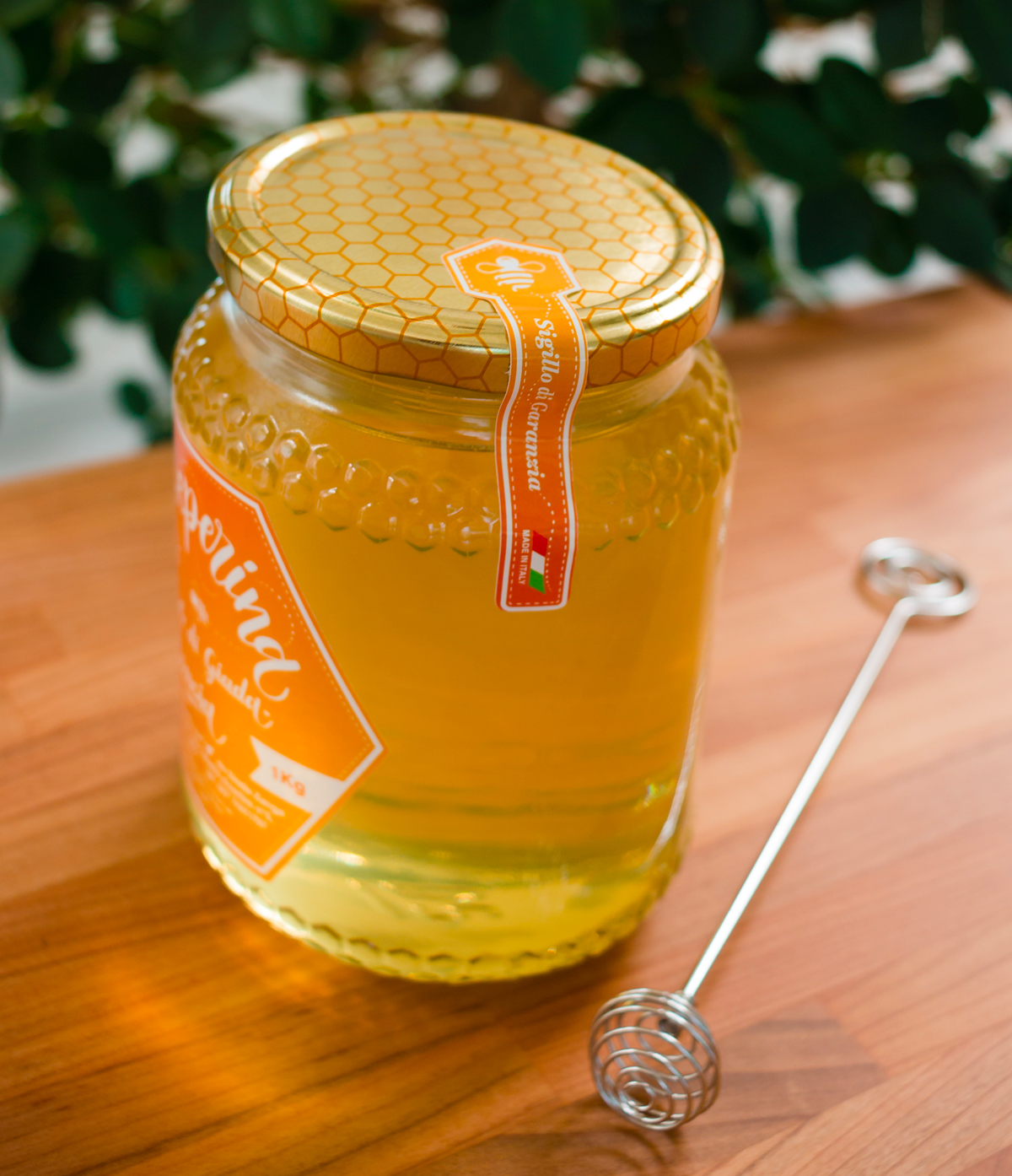




Logo and label design for L'Apeperina Miele, a small artisanal brand dedicated with passion and devotion to the ancient art of producing the precious "liquid gold." In every drop of honey lies a love for nature and the meticulous care of the bees, which transform the nectar of flowers into a sweet and nourishing gift.
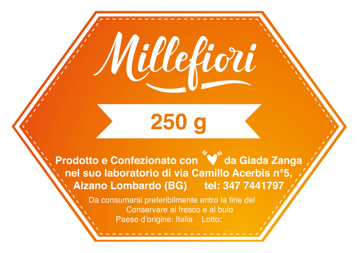
This project idea was born in collaboration with Giada, the heart and soul of L'Apeperina, who desired a vibrant and authentic identity. Thus, a hand-drawn calligraphic logo was created with a Tombow brush pen, capturing the energy and vitality of her brand. The label, nestled within a hexagonal honeycomb, reflects the perfection of nature and the tireless work of the bees.
The initial logo drafts were carefully crafted, and the final result was applied to business cards and labels that wrap around the honey jars, elegantly preserving the sweet treasure within. The 1 kg jar and the smaller 500 g and 250 g versions showcase the power of the negative version of the logo, chosen for its strength and chromatic impact.
Currently, Giada offers two exquisite varieties of honey: Acacia and Wildflower, true nectars of delight. But this is just the beginning, and we eagerly await new varieties that will enrich the world of L'Apeperina, bringing ever-new shades of sweetness and poetry.
Alice Tebaldi